The Role of Color in Creating an Efficient Minimalist Space
Understanding the Role of Color in Minimalist Design
In the realm of design, color acts as a powerful agent that can shape our emotions and perceptions within a living space. This is especially evident in minimalist design, where the use of color transcends mere aesthetics to enhance functionality and promote serenity. Minimalism celebrates simplicity; therefore, the choice of color becomes a pivotal factor in creating an environment that feels cohesive and calming.
Color and Its Impact on Ambiance
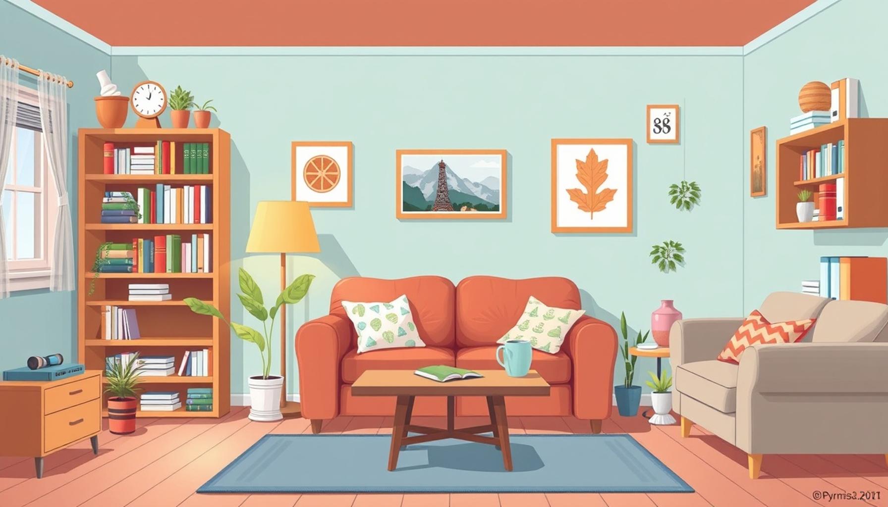
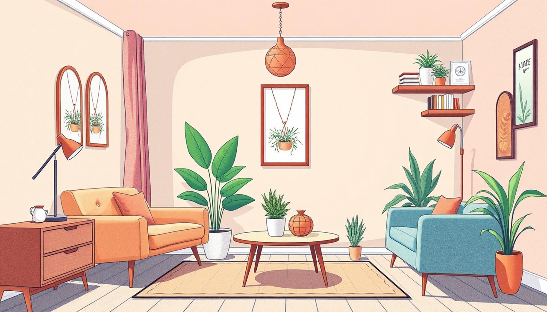
The hues that populate a minimalist space play a significant role in shaping the overall atmosphere. For instance, soft blues and gentle greens are known to evoke feelings of tranquility and relaxation. These cool colors can turn a living room into a sanctuary where one can unwind after a long day. Conversely, warm hues like soft yellows and muted oranges can inject a sense of warmth into the environment, invigorating the space while still respecting the minimalist aesthetic. For example, a touch of mustard yellow on a throw pillow or a piece of artwork can serve as an energizing focal point.
Defining Spaces Without Clutter
In a minimalist setting, distinguishing different areas—such as the dining, living, and workspaces—without the use of visual clutter is vital. Here, different color zones can functionally guide movement. For instance, a darker shade, such as charcoal gray, could delineate a cozy reading nook, while a soft beige might define a workspace. By utilizing color strategically, one can create distinct spaces that feel unified and harmonious, all without the visual noise of excessive decor.
Maximizing Natural Light
Light has a transformative effect on spaces, and the choice of color can significantly enhance its presence. Lighter shades, particularly whites and pale pastels, reflect natural light and can make spaces feel more expansive and airy. In areas of the United States with limited sunlight, such as parts of the Pacific Northwest, leveraging light-reflective colors can combat feelings of confinement often caused by long rainy seasons. For instance, a bright white or soft off-white can create a sense of brightness in a small apartment, making it feel larger and more inviting.
Selecting the Right Color Palette
When curating a color palette for a minimalist space, it’s important to consider not just the aesthetic impact, but also the psychological implications of each choice:
- Neutrals: Shades like whites, grays, and beiges serve as versatile backdrops that complement a variety of furniture styles and textures, promoting a seamless flow throughout the home.
- Accent Colors: Pops of color—such as a bright teal or coral—can be introduced through decorative accents like vases or throw rugs. These subtle touches can energize a space without overwhelming the senses.
- Nature-Inspired Palettes: Greens and earth tones, reflective of nature, not only create a sense of grounding but also foster a connection to the outdoors, a principle particularly resonant in urban spaces where nature may feel distant.
The growing movement towards minimalist living across the United States emphasizes the importance of color psychology in our daily lives. By understanding the interactions of colors with each other and their environment, individuals can craft spaces that resonate with their personal values and promote harmony. As we delve further into the relationship between color and minimalism, we unveil secrets that can significantly enhance how we experience our homes, turning them into tranquil retreats that reflect our inner peace.
LEARN MORE: Click here to discover how to enhance your efficiency
The Influence of Color Psychology on Minimalist Spaces
Color psychology plays a crucial role in how we perceive and interact with our environments, particularly within the context of minimalist design. By understanding the emotional and psychological effects of different colors, you can effectively curate a space that resonates with positivity and functionality. With an array of colors at your disposal, the key lies in selecting those that align with your personal comfort and aesthetic preferences, enhancing both efficiency and enjoyment in your minimalist space.
Emotional Responses to Color Choices
Each color evokes distinct emotional responses, which can significantly shape the experience of a room. Here’s a closer look at how specific colors can create feelings that align with minimalist principles:
- Blue: Known for its calming properties, shades of blue can promote a sense of peace and concentration. This makes blue an excellent choice for home offices or reading areas where focus is paramount.
- Green: Often associated with nature and vitality, green hues can instill feelings of renewal and balance. Using various shades of green in spaces like kitchens or living rooms can create an energizing yet tranquil atmosphere.
- Yellow: A vibrant yellow can uplift spirits and foster creativity, making it a fantastic option for artistic spaces or playrooms. However, it’s important to use yellow sparingly to maintain the serenity that minimalism advocates.
- Gray: As a neutral and timeless shade, gray can create a sophisticated backdrop that encourages harmony. It pairs well with bolder accent colors while maintaining the simple elegance central to minimalist design.
By directing attention to how colors influence our moods, you can harness their potential to foster an environment that not only looks good but also feels good. The strategic use of color can augment functionality, enabling spaces to serve their intended purposes effectively while maintaining an uncluttered aesthetic.
Creating a Cohesive Color Story
A carefully curated color palette can weave a story through your home, providing a sense of continuity that is essential in minimalist design. When selecting colors, consider how they will transition from one space to another. Consistent tones across rooms help to maintain a harmonious flow, making your interior feel unified and expansive.
To craft this cohesive color story, adhere to a set of guiding principles:
- Limit Your Palette: Choose a base of two to three main colors and complement them with a few accent colors. This restrained approach allows for visual harmony without overwhelming the senses.
- Incorporate Textures: To add depth while adhering to a minimalist aesthetic, consider layering different textures within your color scheme. This tactic enhances visual interest without introducing clutter.
- Personalize Through Accents: Incorporate personal elements, such as artwork or decorative items, within your chosen palette to add a personal touch without sacrificing minimalism’s core principles.
Understanding these subtleties can transform the way you perceive color in your home, allowing you to create an efficient minimalist space that feels as good as it looks. Moving forward, we will explore practical applications of color in specific areas of your home, providing you with multifaceted options to refine your approach further.
The Impact of Color Psychology in Minimalist Design
When it comes to achieving a tranquil atmosphere in minimalist spaces, color psychology plays a critical role. Colors can evoke emotions and affect our psychological well-being, making their selection vital for a minimalist aesthetic. For example, soft hues, such as pastels or neutral shades, can create a calming environment that promotes relaxation and focus. In contrast, vibrant colors like red or yellow can inject energy into a space but may overwhelm a minimalist design if not used sparingly.Incorporating natural light with color also enhances the minimalist appeal. By using light, neutral tones, such as whites or light grays, one can reflect sunlight, making the space feel larger and more open. Additionally, a well-thought-out color palette helps in creating visual cohesion. This aspect is paramount when emphasizing key pieces of furniture or artwork, allowing them to stand out without cluttering the visual field.Another important consideration is how colors interact with textures in minimalist spaces. High-gloss surfaces paired with darker shades can create a dramatic look, while matte finishes with lighter tones lend an airy quality. Combining these elements strategically can lead to sophistication and warmth without compromising on minimalist principles. Moreover, color trends evolve but maintaining a personal touch through your unique color choice can resonate with your sense of style, thus enhancing your living space aura. As we explore various themes and influences behind color choices in minimalist spaces, it is clear that understanding color dynamics is integral to fostering a well-designed and efficiently organized environment.
| Advantages | Impact on Minimalist Spaces |
|---|---|
| Enhanced Focus | Soft colors reduce distractions, aiding concentration. |
| Calming Effects | Neutral tones foster tranquility, supporting mental well-being. |
| Visual Cohesion | A curated color palette complements sleek designs. |
As we delve deeper into the practical applications of color in minimalist design, we recognize the myriad ways it can elevate not just aesthetics, but functionality and emotional comfort within our living spaces.
DISCOVER MORE: Click here to learn about mindful consumption
Practical Applications of Color in Minimalist Design
Implementing color effectively in your minimalist space requires not only an understanding of color theory but also an awareness of how these choices impact your everyday experience. From enhancing productivity to promoting relaxation, the right color selections can drastically influence the atmosphere in your home. Let’s explore how to apply color with intention across various rooms in your house.
Living Rooms: Fostering Connection and Comfort
In a minimalist living room, color choices should facilitate warmth and comfort while keeping the aesthetic uncluttered. Utilizing neutral tones such as beige, white, or soft gray creates a soothing backdrop, allowing for easy integration of bolder accents. Consider implementing a pale taupe as your primary color with splashes of mustard yellow or deep blue through cushions or art pieces. This approach ensures a lively yet balanced environment, promoting social interaction and relaxation.
Kitchen Spaces: Energizing and Inviting
The kitchen is often referred to as the heart of the home, making color selection vital in creating an inviting atmosphere. Whites and light pastels reflect cleanliness and brightness, ideal for this often-busy space. Adding elements of sage green or soft peach can bolster the connection to fresh ingredients and evoke feelings of vitality. A consistent color accent across cabinetry and decor can also streamline the overall look while enhancing efficiency in meal preparation and gathering.
Home Offices: Enhancing Focus Through Color
For those working or studying at home, the workspace’s color palette must encourage concentration and creativity. Soft blues and greens are excellent choices for a minimalist home office. These colors help to reduce stress and enhance productivity. According to a study by the University of British Columbia, people working in blue rooms reported higher levels of productivity due to the calming effect of the color. Incorporate sky blue for walls, complemented with white furniture and pops of orange in your stationery or artwork to stimulate creativity while keeping the space serene.
Bedrooms: Creating an Oasis of Rest
Your bedroom should serve as a sanctuary for relaxation, making color choice particularly significant. Soft and muted tones, such as lavender, powder blue, or peach, can effectively create a tranquil environment conducive to sleep. It’s important to emphasize that darker shades, when used sparingly on an accent wall, can add depth without overwhelming the minimalistic aesthetic. Limit the use of color to keep distractions at bay, focusing instead on natural light and textiles that embody your chosen palette.
Bathrooms: Invoking Freshness and Serenity
In bathrooms, where cleanliness is paramount, a minimalist approach to color can enhance the feeling of space and sanitation. Whites and soft blues dominate in many modern bathroom designs, reflecting light and exuding a sense of freshness. Enhancing these tones with plants in natural substrates can provide a lively contrast while promoting a spa-like environment. Consider adopting light gray tiles with pure white fixtures for an elegant yet functional space, ensuring the room feels both clean and welcoming.
The calculated application of color across different areas of your home not only upholds minimalist principles but also enhances the overall efficiency and enjoyment of the space. By aligning color choices with the intended emotional and functional outcomes, you can craft a home that reflects clarity and purpose.
DIVE DEEPER: Click here to discover the power of time blocking
Conclusion: The Power of Color in Minimalist Spaces
In conclusion, the role of color in crafting an efficient minimalist space cannot be overstated. Thoughtful color choices serve as fundamental design tools that shape not just aesthetics, but also emotions and functionality across different areas of your home. By selecting a cohesive palette that aligns with the purpose of each room, you can significantly enhance the atmosphere, making it a haven of productivity, relaxation, or connection.
The utilization of neutral tones in living areas fosters a welcoming environment, while implementing vibrant accents can energize spaces like kitchens and offices. Meanwhile, calming shades in bedrooms and bathrooms create sanctuaries of rest and rejuvenation, enhancing your overall well-being. As we increasingly recognize the impact of our environments on mental health, the strategic use of color becomes essential in minimalist design.
Moreover, embracing color theory not only leads to visually appealing results but also plays a crucial role in enhancing clarity and purpose within a minimalist framework. The less is more philosophy encourages a focus on the essentials, where every hue is chosen deliberately, contributing to the overall narrative of the space.
As you embark on your journey to create or refine your minimalist haven, consider the profound influences of color, and let these insights guide you. By infusing your environment with thoughtful color choices, you can create a harmonious balance that enhances your daily experience. Dive deeper into color theory, explore various palettes, and discover how these elements can truly transform your minimalist space into a reflection of your style and serenity.
Related posts:
Eco-Friendly Minimalism: Creating Efficient Spaces with Sustainable Practices
Designing Functional Zones: How to Organize Your Home for Maximum Efficiency
Incorporating Multi-Functional Furniture: A Guide to Efficient Space Design
The Psychology of Space: How Minimalism Affects Your Mental Clarity and Focus
Multi-Functional Furniture: Innovating Efficient Space in Minimalist Interiors
Smart Storage Solutions: Innovative Ideas for Efficient Minimalist Spaces
Beatriz Johnson is a seasoned minimalist and writer with a passion for simplifying the complexities of personal organization and decluttering. With over a decade of experience in the field, she specializes in topics like minimalist living, efficient organization strategies, and creating intentional spaces. Through her work, Beatriz empowers readers to make mindful decisions about their belongings, streamline their lives, and embrace a more organized and fulfilling lifestyle.